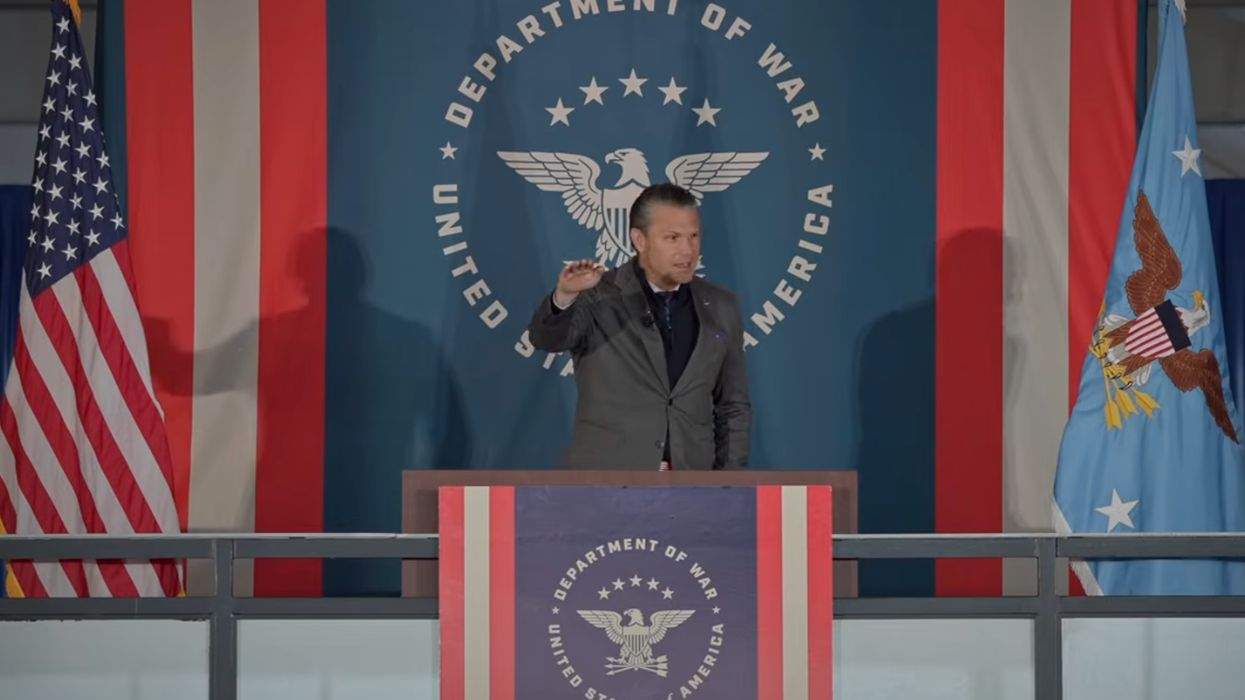
Pete Hegseth stood before Air Force Academy cadets on Saturday in front of a Department of War logo that does not appear in the Pentagon's own branding guide. The stiff, straight-winged eagle behind him drew immediate comparisons to the Reichsadler used by Nazi Germany, and the department's own rulebook says nobody is supposed to be freelancing the design.
A Logo Nobody Approved
According to Advocate.com, the backdrop at Hegseth's speech was a monochrome logo that differs from the designs in the Defense Department's official branding guide. That guide features a simplified line rendering of the Pentagon building at the top of the department's website, along with a version of the historic seal used on social media.
So this was not the official logo. It was not the official seal. It was a third thing, a mystery eagle, hovering behind the Secretary of Defense while he addressed future officers.
Somebody built this. Somebody printed it. Somebody hung it behind the man in charge of the largest military on Earth, and nobody in that chain said, "Hey, does this match the guide?"
The Seal It Replaced
The historic seal dates to 1947, when it was approved for the National Military Establishment, the Defense Department's predecessor, Advocate.com reports. It shows an eagle carrying three arrows to represent the Air Force, Army, and Navy. Rays and stars sit above it, representing glory. Olive and laurel leaves sit below it, representing peace and honor in combat.
That last part matters. The old seal has a whole peace-and-honor situation going on at the bottom. The eagle behind Hegseth dispenses with the laurel and olive branches entirely. Instead of 13 stars and radiating rays, the backdrop has five stars and no rays.
The department that now calls itself the Department of War looked at a seal featuring branches of peace and decided to drop them. You can call that a branding choice. You can also call it the most on-the-nose edit in the history of government graphic design.
Those Wings, Though
The eagle's wings drew the most scrutiny online. Rather than the feathered, naturalistic look of the historic seal, the upper edges of the wings form an almost straight line divided into three sections, according to Advocate.com. Even the blue-and-black monochrome versions of the seal in the brand guide keep their detailed feathers.
The head, per the report, looks much like the one on the department's seal. It is the rigid wings that prompted comparisons to the eagle imagery used by the Nazi regime. The Reichsadler depicts an eagle clutching a wreath surrounding a swastika, and similar eagle imagery appeared behind Hitler during speeches.
To be clear, there is no swastika here. Nobody is claiming there is. The complaint is about the silhouette, and about the fact that somebody had a full-feathered eagle on file and chose the angular one instead.
The Rulebook Says Don't Do This
Here is the part that should make even the most defensive Hegseth apologist pause. The Pentagon's branding guide is not vague. "The official DOW seal should in no way be edited or presented in any way except how it is displayed above," the guide states, as quoted by Advocate.com. "The size of the seal is the only variable that can be changed, while adhering to the minimum sizing requirements outlined above."
The size is the only variable. Not the wings. Not the stars. Not the branches. Not the rays.
This administration loves to tell federal workers that rules are rules. Strict compliance, no exceptions, follow the guidance. And yet the Secretary himself spoke in front of a design that appears to break the department's own written standards on a podium facing cadets.
The Internet Did What the Internet Does
Art critic Seema R. discussed the logo changes on Instagram. "Accidental Nazi is just not a thing," she said, per Advocate.com. Liberal influencer Brian Krassenstein compared Hegseth's gestures to Hitler's, highlighting the similar imagery behind them. "It's almost as if they're going out of their way to make it seem like they are Nazis," Krassenstein wrote on X.
Some of that is internet heat, and it should be read as such. Comparing a Cabinet secretary's hand movements to Hitler's is the kind of thing that gets a lot of shares and settles nothing. The logo is the actual documented oddity here, because it can be checked against the department's own brand guide, and it does not match.
The Dingo Take
"Accidental Nazi is just not a thing." Fine. Take that at face value, then. If an accidental Nazi eagle does not exist, that leaves two options for how a stiff, angular, rule-breaking eagle ended up behind the Secretary of Defense. Either someone chose it on purpose, or someone in a department that now brands itself around war could not be bothered to check the design against a brand guide that says the size is the only thing you can change.
We do not know which it was. The reporting does not say who made the backdrop or why. What we do know is that the Pentagon wrote down exactly how its seal must look, and then the man at the top spoke in front of something else. Honest incompetence and deliberate provocation both land badly for a guy who spends his speeches lecturing cadets about discipline and standards.
Here is the simple fix. Put up the real seal. It has a perfectly good eagle on it, plus the laurel and olive branches that the new version apparently found too peaceful. If the department cannot manage that, maybe stop telling everyone else to get squared away.



Comments